POLYSTO
Case Study · Polystox · 2025
Squeezing a Web
Platform onto a Phone
A polymer trading platform wanted a mobile app that "feels exactly
like the web." That request aged like milk at room temperature.
Role
Product Designer (Lead)
Company
Techdome Solutions
Timeline
4 Weeks
Platform
iOS & Android (MUI)

The opening
The brief that started simply and
didn't stay that way
The ask landed in my inbox with the confidence of someone who's never tried to port a
Bootstrap data table onto a 375px screen.
"Create a native mobile app with the same experience and UI as the web platform."
The web platform was built on Bootstrap. The mobile app needed to be built on MUI. A 1:1
reuse of components? Impossible. A 1:1 replication of the information architecture? I'll be
honest — I tried. For about two days. Then I looked at my wireframe of an 8-column filter
sidebar crammed onto a 390px iPhone screen and decided we needed to rethink
everything from scratch.

Native mobile UX patterns
Me: Building a brand new DS
The original web design specs
What followed was six months of competitive research, component rebuilds, user flow
surgery, and one very heated conversation about whether a bottom sheet was "too
consumer-y" for a B2B trading platform. (It wasn't. Yaar, Blinkit ka filter bottom sheet use
karte hain — our users are human beings too.)
This is that story.
01 — Problem & Context
A successful product, a mobile gap,
and a brief that underestimated
both
Polystox is a B2B polymer trading platform — think of it as a marketplace where
businesses buy and sell industrial plastics across India. Sellers list inventory, buyers
browse and filter by grade, quantity, price and region, place orders, track payments, and
manage returns — all from a web dashboard that was working well.
The problem? Their users were increasingly on the move. Sales reps checking orders
between client visits. Procurement managers browsing inventory on the factory floor. The
web platform on a mobile browser was barely functional — pinch-zooming into data
tables, accidentally tapping the wrong filter, losing their place in a multi-step order form.
The demand for a real mobile app was loud and getting louder.
"The web platform was built for a desk. The users
had left their desks."
The stakeholder brief was well-intentioned but technically naive. They wanted:
1
Identical UI — same colors, same components, same layouts as the web
2
Identical features — nothing missing, nothing deprioritized
3
Launched fast — because "it's just making the web version smaller, right?"
🔥 Behind the scenes
The web platform used Bootstrap. The mobile app was to be built on MUI (Material UI). These
two frameworks share no component DNA whatsoever. Every single component — buttons,
inputs, dropdowns, tables, modals — had to be rebuilt from scratch in MUI. "Just making it
smaller" was never on the table.
My job was to navigate this gap — to honor the spirit of the brief (brand familiarity, feature
parity) while designing something that actually worked on a 6-inch screen. The guiding
principle I set early and defended often:
"Maintain the brand. Betray the layout."
02 — Research & Discovery
What competitors got wrong, and
what Zomato got very right
Before touching Figma, I spent two weeks in pure research mode. Two tracks running in
parallel: understand what the competition had built, and understand what "good mobile
UX" actually looks like for dense, data-heavy products.
The competitive audit (a.k.a. the hall of broken filters)
I audited three direct competitors in the polymer trading space — Source One,
OfBusiness, and BSB. I was looking specifically at information placement, component
design, and how they handled filtering. The findings were not encouraging.
Competitor
Biggest Mobile Failure
Opportunity for Polystox
Source One
Data tables directly ported from web —
horizontal scroll on a 6" screen
Card-based listing with scannable
hierarchy
OfBusiness
Filtering buried 3 taps deep — users gave up
before filtering
Surface filters with one-tap access,
powerful but progressive
BSB
Outdated UI eroding trust — felt like a 2016
Android app
Modern component design that signals
reliability
The gap was clear: no competitor had cracked mobile-first UX for polymer trading. The
field was wide open for Polystox to set a new standard.
The inspiration audit (borrowing from the best)
For what "good" looks like, I looked completely outside our industry. If your users are
Indian, browsing on a phone, comparing options, and making purchase decisions — you
study Zomato, Blinkit, and Meesho. Not because we're a food delivery app, but because
these products have solved the same core UX problems we were facing.
↗
From Zomato: How to handle complex filtering without overwhelming the listing view. Their
filter system is powerful but never visible until you need it.
↗
From Blinkit: Scannable product cards that let you compare multiple items at a glance without
opening each one.
↗
From Meesho: Multi-step flows broken into single-purpose screens — each screen does one
job, nothing more.
Key Insight
The best B2C mobile apps had already solved our B2B UX problems — we just needed to adapt
the patterns to a trading context, not reinvent them. Our users are buyers and sellers, but first
they're people who use Zomato on Saturday night.
02.5 — Information Architecture & User Flows
Mapping the structure before
touching Figma
Before I designed a single screen, I needed two things locked in: how the app is organised
(IA) and how users move through it (flows). These are the blueprints. Skipping them and
jumping straight to UI is how you end up redesigning the same screen four times. Main
yeh galti pehle kar chuka hoon.
Information Architecture — the big structural shift
The web platform used a persistent left sidebar for navigation — all sections always
visible, always one click away. Mobile meant one thing: a bottom tab bar with 5 primary
destinations. Mapping this forced an early decision that turned out to be one of the most
important ones in the project.
On the web, Payments lived as a sub-section inside Orders. Made sense — you place an
order, then you see the payment. But when I talked to sellers, I found that checking
payment status was the first thing most of them did every morning. It had nothing to do
with placing orders. So Payments got promoted to its own bottom tab.
Structure follows
user behavior, not the web hierarchy.
Information Architecture — Polystox Mobile App
Polystox
Mobile App
BOTTOM TAB NAVIGATION
Home
Marketplace
Orders
Payments
↑ promoted to tab
Profile
Dashboard
Overview
Browse Offers
Offer Detail
Filter Sheet
Active Orders
Order History
Order Detail
Pay History
Invoices
Settings
Notifications
Primary navigation tab
Promoted from sub-section
Sub-screen / nested view
Payments sub-screens
User Flow 1 — Marketplace Browse & Filter
The most frequent task in the whole app. A buyer lands on the marketplace, sees ~200
offers, and needs to narrow them down to the 3–4 that actually match their spec — right
grade, right quantity, right price range, right region. The flow had to make filtering feel
fast, not like filing a form.
The key design tension here: the filter is the most powerful feature in the app, but it can't
be the first thing a user sees. It needs to be discoverable without dominating. One "Filter"
button + a bottom sheet = one tap to power, zero visual clutter when you don't need it.
User Flow — Marketplace Discovery & Filtering
Open App
Home Dashboard
Marketplace Tab
Browse Offers
Tap Filter
Button
ENTRY PATH
FILTER & DISCOVER
Bottom Sheet
Opens
Select Filters
8 categories
Apply Filters
Sheet closes
Filtered Results
Offer Cards
Offer Detail
→ Order Flow
Entry / Exit node
Key interaction (filter trigger)
Screen / state
Row continuation
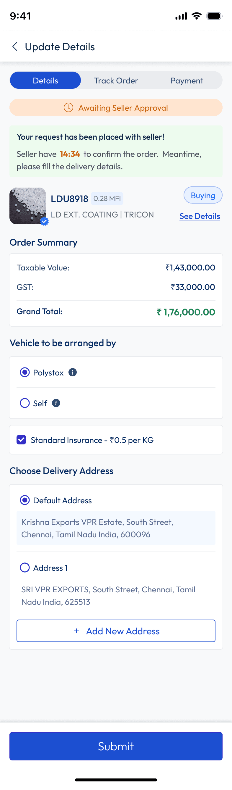
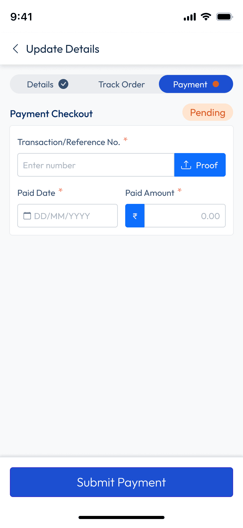
User Flow 2 — Order Placement (Multi-Step)
This was the most complex flow to redesign. The web version was a single long-scrolling
page — every field for every part of the order stacked vertically. On mobile, scrolling past
an error without knowing it exists is a real problem. And there's nothing more frustrating
than filling out 40 fields only to hit a validation error at step 1.
The solution: break it into 4 focused screens, each doing one job. A progress indicator at
the top means users always know how far they've gone — and how little is left. Cognitive
load halved. Error recovery improved. And as a bonus, each step can validate
independently before letting the user proceed.
User Flow — Order Placement (Multi-Step)
PROGRESS INDICATOR (per screen)
Offer Detail
Entry point
Tap "Place Order"
Primary CTA
STEP 1
Order Details
STEP 2
Delivery Terms
INITIATE ORDER
COMPLETE & CONFIRM
STEP 3
Payment Method
STEP 4
Review & Confirm
Order Confirmed
Success state
Active Orders
Auto-redirects
Primary CTA trigger
Multi-step screens (4 steps)
Terminal state
Entry / auto-redirect
Why this matters for Amazon SmartHub
Multi-channel seller dashboards face the exact same problem: dense data, complex ordering
workflows, and users who are always on the move. The IA and flow decisions made here —
promote what's checked daily, break complex forms into focused steps, make filters powerful
but invisible — apply directly to any B2B commerce platform.
03 — Design Process & Iterations
The messy middle: everything we
tried, killed, and rebuilt
First: building the design system foundation
Before designing a single screen, I spent two weeks establishing the design system.
Because everything had to be rebuilt in MUI anyway, this was my chance to create
something scalable rather than patching together one-off components.
The rules I set and stuck to throughout:
4pt
Grid system: Every spacing value — margins, padding, gaps — is a multiple of 4px. No
exceptions. This eliminated "close enough" guesswork and made developer handoff
dramatically cleaner.
🎨
Color tokens: Reused the web platform's exact color token system. This was non-negotiable
for brand consistency — a Polystox button needed to feel like a Polystox button whether on
desktop or mobile.
42px
Touch targets: Every interactive element met a minimum 42×42px tap target. Not because a
guideline said so, but because I watched our stakeholder struggle to tap filters during a demo
on his actual phone.

The great filter debate
The web platform had 8 distinct filter categories living in a persistent sidebar. This was
the biggest design challenge of the entire project — and the decision I'm most proud of.
My first instinct was a sidebar filter panel — the same pattern users already knew from the
web. I mocked it up properly. Then I opened it on an actual 14" laptop (small, like our users
might have) and watched what happened: the product listing was reduced to a narrow
strip. Dense. Claustrophobic. Unusable.
🔥 Failed first approach
The sidebar filter mock got killed in the first stakeholder review. Not by me — by the
stakeholder themselves. They opened it on their phone, stared at it for five seconds, and said
"yaar, this looks cramped." Sometimes user testing happens in meeting rooms. Jo bhi ho,
kaam aaya.
We evaluated three options:
❌ Killed
Sidebar panel
Familiar from web but destroys listing visibility on
mobile. Cramped, hard to close, confusing on
small screens.
❌ Also killed
Top filter chips
Works for 3–4 filters max. With 8 categories, the
chip row becomes its own UX problem —
horizontal scroll, overflow, visual noise.
✓ Shipped
Bottom sheet drawer
All 8 filter categories consolidated behind a single
"Filter" button. Progressive disclosure — powerful
but invisible until needed. Native to mobile.
The bottom sheet approach was borrowed directly from the Zomato playbook. It gave us
the full filtering power of the web platform without cluttering the primary listing view. The
stakeholder initially pushed back — "ye toh Swiggy jaisa lagta hai" — and I took that as a
compliment.


The table-to-card transformation
On the web, marketplace offers lived in a dense data table — 8 columns, sortable headers,
row-level actions. This is the component I spent the most time on because it's the heart
of the product. Get this wrong and the whole thing fails.
Putting a table on mobile means horizontal scrolling. Horizontal scrolling on a
marketplace means users can't compare items. Can't compare items means they can't
make purchase decisions. The table had to die.
What replaced it was an Offer Card — a vertically-oriented component that surfaced
exactly the information a buyer needs to make a quick decision: grade, quantity available,
price per kg, seller rating, and location. One tap to expand for full details. Scannable in
under 2 seconds.
📊 Web Table → Mobile Offer Card Side-by-side comparison: left shows the web data
table, right shows the mobile offer card with annotations pointing out how each data
point was mapped. This is your strongest before/after visual.


Redesigning the order flow
The web platform's order page was a single long-scrolling page — every section of an
order (details, delivery, payment, tracking) stacked vertically. On desktop with a sidebar,
this worked. On mobile, it was a scroll of doom.
My solution: break the single page into a guided multi-step flow. Each screen owns
exactly one task. Users always know where they are and what's next. Cognitive load
drops. Error rates drop. The "overwhelming form" problem dissolves.


04 — Final Solution & Outcomes
What shipped, and what it felt like
when it did
After six months of research, iteration, stakeholder debates, and more component
documentation than I'd like to admit — we shipped a mobile app that felt nothing like the
original web platform, yet felt completely like Polystox.
The key design decisions that defined the final product:
1
Offer Cards over tables: Every marketplace listing became a scannable card. Buyers can
compare 3–4 offers on screen simultaneously without scrolling horizontally or tapping into
each one.
2
Bottom sheet filters: All 8 filter categories consolidated into one surface, accessible in one
tap. The main listing stays clean and focused.
3
Multi-step orders: The single-page order form became a 5-step guided flow — each screen
doing one job, with clear progress indication throughout.
4
Design system: A full MUI-based component library with tokens, variants, and documentation
— meaning every future screen the team builds will be consistent without needing to reinvent
patterns.
The first full demo — when the stakeholder opened the filter bottom sheet on their own phone
and immediately found what they were looking for — was the moment I knew we'd made the
right calls. The product felt native. It felt fast. It felt like it belonged on a phone. That was the
entire goal.
The design system delivered a secondary win that wasn't in the original brief: new
screens that engineering built after handoff stayed consistent with the design without
needing constant designer check-ins. The component documentation did its job.
05 — Reflections & What I'd Do Differently
Honest takes from someone who
lived inside this for few weeks
01
I should have pushed for user testing on the filter bottom sheet before finalizing it
We validated the bottom sheet pattern through competitive benchmarking — Zomato uses it, Blinkit
uses it, it works. But we never tested it with actual Polystox users before shipping. Some edge cases
around saved filter states and multi-select behavior only surfaced after handoff. Next time, even a 3-
person hallway test before final designs would've caught this.
02
The "make it feel like the web" brief was actually useful — just not how the stakeholder
intended
My instinct was to push back on the brief immediately. But sitting with it longer, I realized the brief
wasn't about literal pixel parity — it was about trust. Existing web users needed to feel at home.
Honoring the color system, the component names, and the information hierarchy (even if rearranged)
gave us that trust without replicating bad UX. The brief was a feeling, not a spec.
03
B2B users are people too, and they have Zomato on their phones
The most heated debate was over using consumer app patterns (bottom sheets, card listings) in a
B2B trading context. The concern was that it would feel "too casual" for a professional tool. I
disagreed — and shipped anyway. The users didn't care about the pattern's origin. They cared that it
was fast, legible, and didn't make them pinch-zoom. B2B ka matlab ye nahi ke experience boring hona
chahiye.
04
Design systems are the gift that keeps giving — but only if you document while
building, not after
I made the mistake of doing most component documentation in the last two weeks of the project,
working from memory. Some usage guidelines were incomplete because I'd forgotten the context of
decisions I made in month two. The system still shipped well, but the documentation would've been
sharper if I'd written it in real time. Now I comment my Figma variants the same day I build them.

Porting the web UI onto mobile and calling it a day
2 Weeks of rethinking every pattern from first principles
"The best mobile design doesn't feel like a
shrunken website. It feels like the product was
born on a phone."
That's the standard I set for this project on day one. I don't know if we hit it perfectly — but
we got a lot closer than a Bootstrap port ever would have.
